AFFINITIES
University of Alberta,
2014 BFA Graduation Catalogue
book design, identity, logo, postcard, invitation, poster
The artists had decided to title their exhibition Affinities, and after some discussions I presented them with two design options. The direction that they chose was designed around the idea of sharing respect, admiration and ideas while maintaining and crafting a unique identity within a community. The wordmark illustrates this idea by extending only the I's in Affinties, while the enclosure and uniform typeface create security and togetherness.
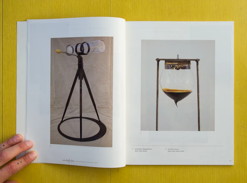
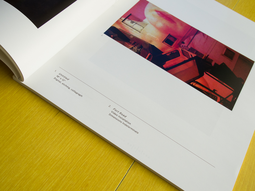
The art catalogue was designed to showcase the individual artists and their work samples. 4 (or 5) years of work weeded down to 4 images each. I felt it was my job to make sure those images got their due attention. I designed the elements of the catalogue to be complimentary, and not a main focus and utilized clarity, white space, and a minimal layout to achieve this. The colour schemes were chosen to be warm and comfortable while also complementing the tones in the portrait photography that were provided to me by Miranda Mewhort and Jonathan Sherrer.


