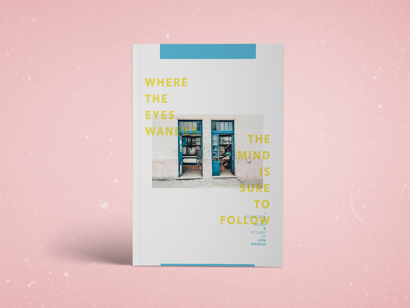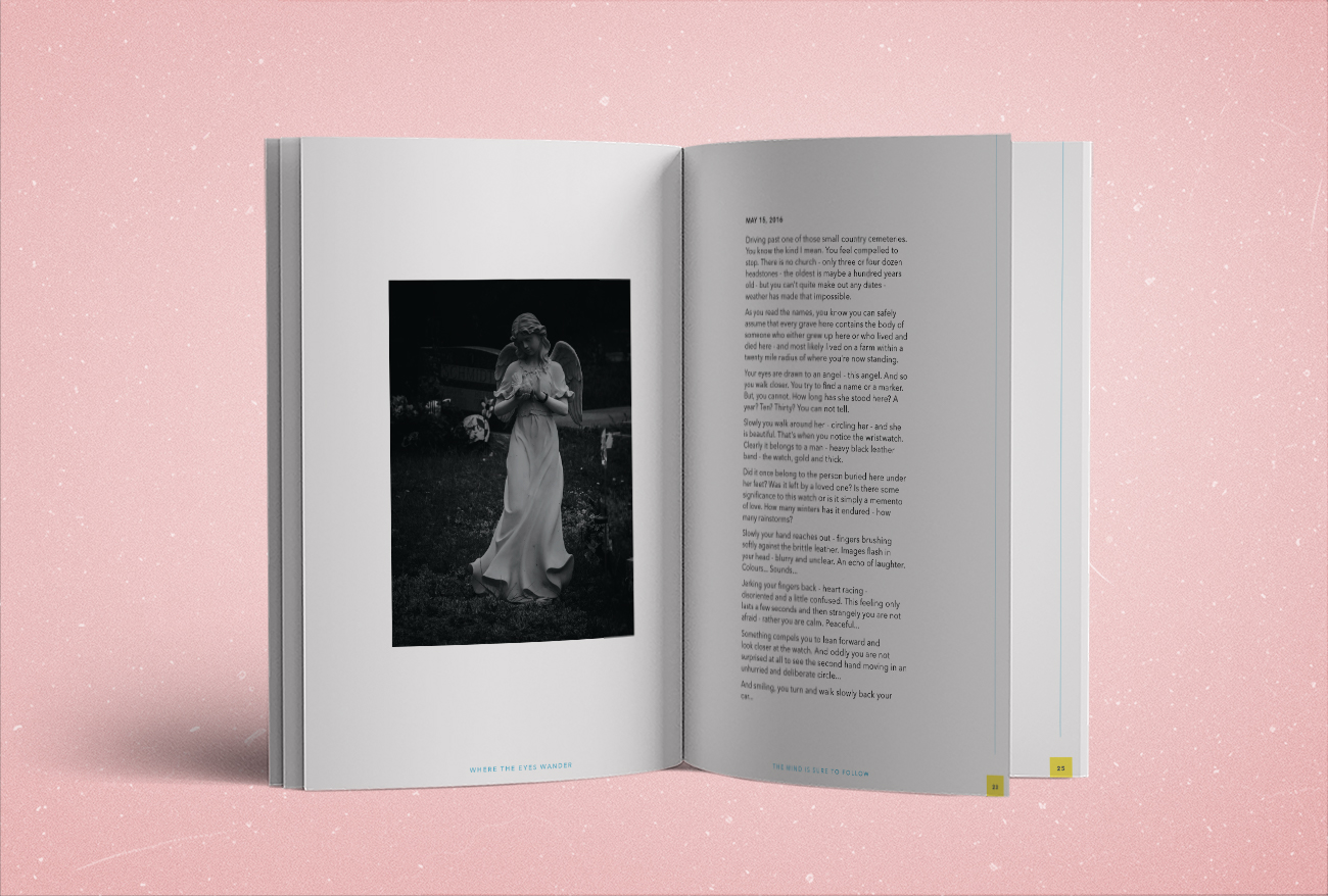
Where the eyes Wander
Photography Book
book design, layout, typesetting
A photography book that wanted to show two things; words and pictures. Simple...
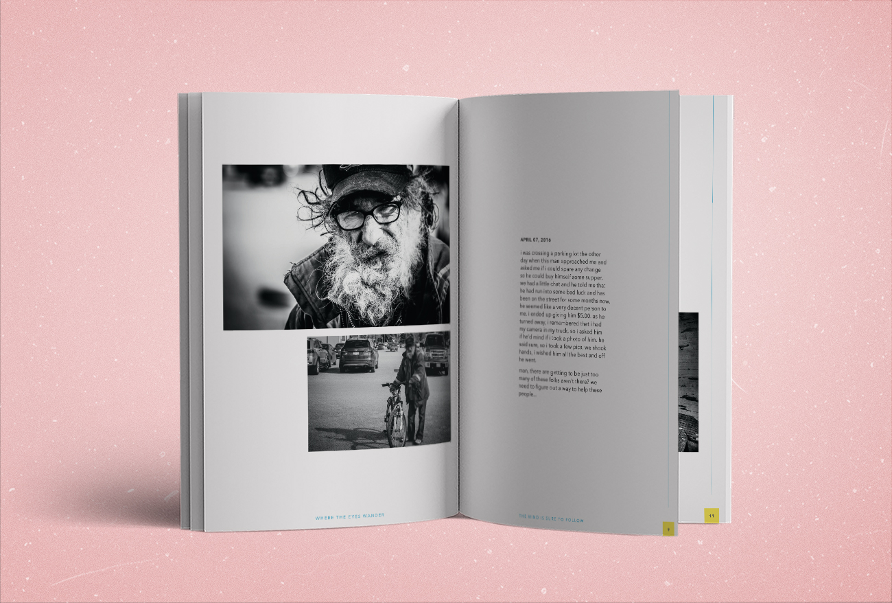
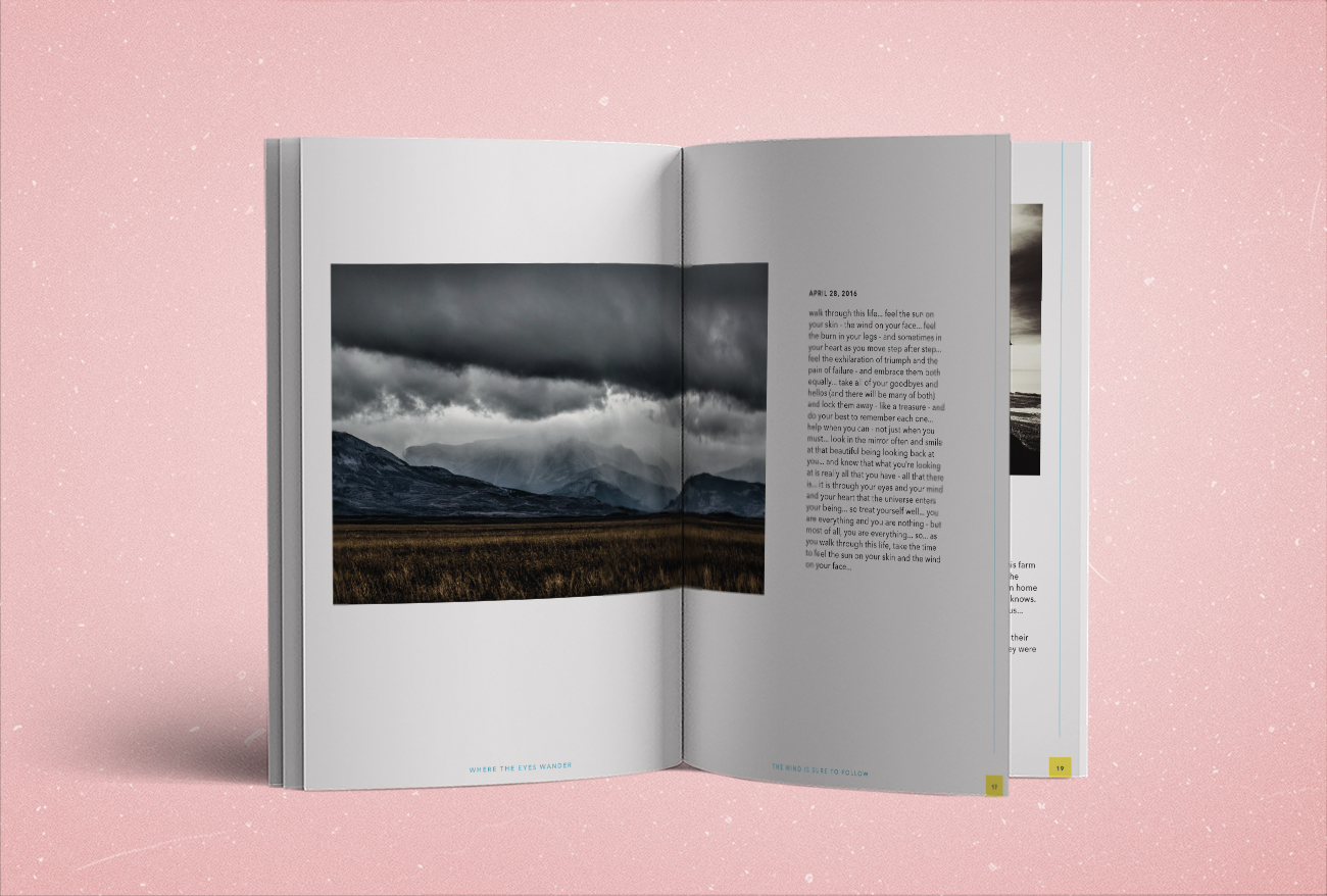
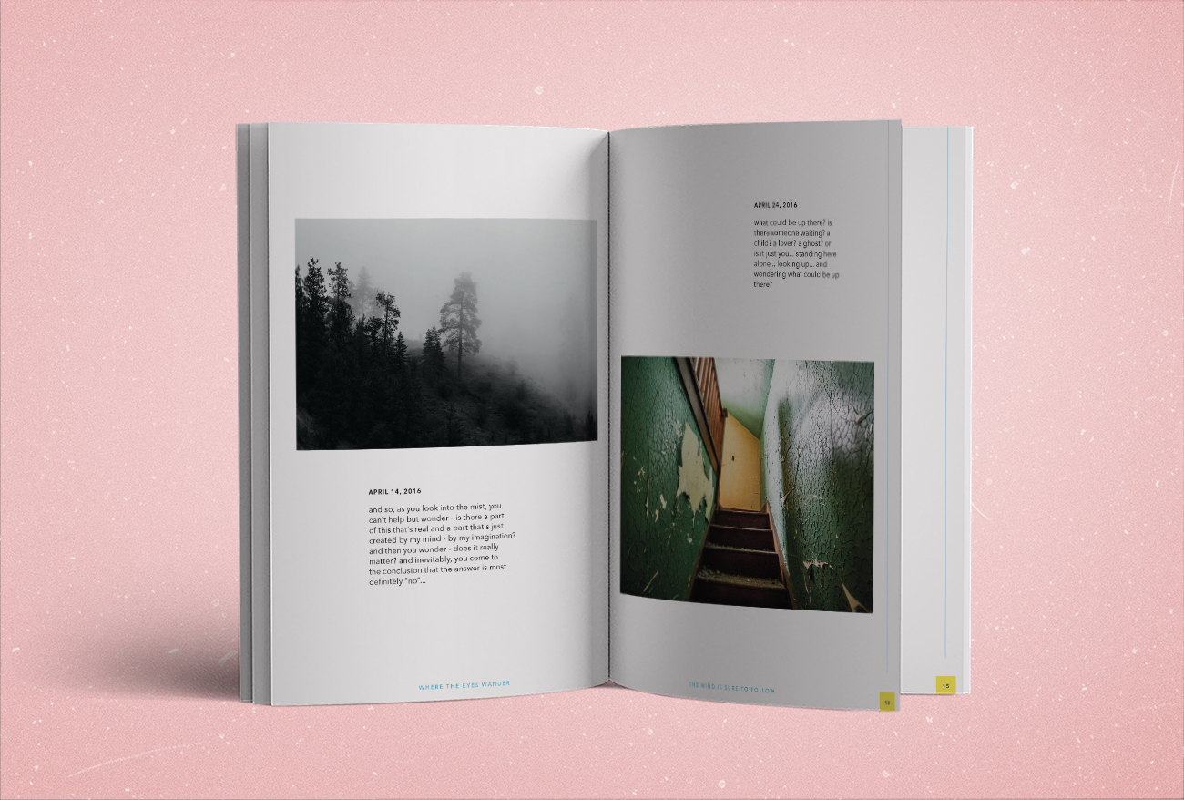
A simply defined purpose usually pairs nicely with a simply defined design. I used heavy doses of white space to accompany and neutralize the various tones and balances of the photos. This also allows the text to command some attention, which it equally deserves. Throw in a no-nonsense typeface, hit with a little 70's pop art colouring to keep the expectations hopping a little. And we were left with 34 pages of freshly presented content for you to flip through.